Behind the Design: Washington Park Logo
Washington Park is more than just a park—it’s a vibrant community of destinations that includes the Oregon Zoo, Portland Japanese Garden, World Forestry Center, Hoyt Arboretum, International Rose Test Garden, historic reservoir, and more. When the time came to update the Park’s logo, we partnered with the innovative design consultancy, sparks+sullivan, to visually represent this incredibly unique part of Portland, Oregon.
We recently had the pleasure of re-connecting with founders Ryan Sullivan and Gwen Sparks Sullivan, a husband-and-wife duo committed to designing human-centered brands. We started our conversation by Washington Park’s south entrance and continued at the serene Vietnam Veterans of Oregon Memorial to learn how they distilled two decades of personal experience and almost a year of research into a single, compelling logo.
The Design: “It’s More Than Just a Zoo”
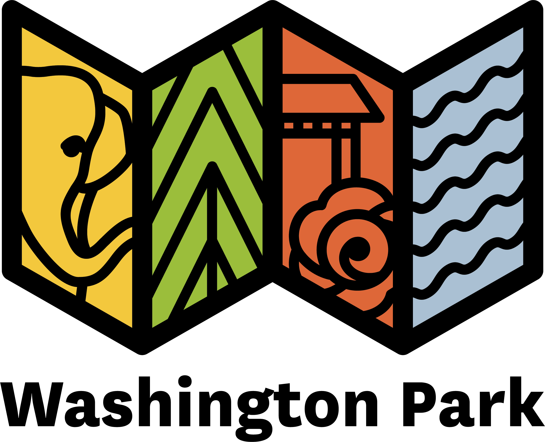
The Washington Park logo is instantly recognizable for its unique, accordion-like shape. According to Gwen, the inspiration was simple: the concept of a folded map.
“As you can see, it has a unique shape. It could look like a W, like Washington Park, but really it’s the shape of a map. The Park spans a large area, geographically, and it’s inherently an invitation to explore.”
The logo is divided into four distinct panels, each with iconography representing one of the Park’s key zones:
- Yellow/Elephant: A clear nod to the Oregon Zoo.
- Green/Trees: Symbolizing the natural beauty and trails of Hoyt Arboretum and World Forestry Center’s mission to bring people and forests together.
- Red/Rose + Japanese Structure: Representing the beauty of the International Rose Test Garden and Portland Japanese Garden.
- Blue/Waves: Denoting the presence of the serene Washington Park Reservoir.

Ryan added, simply, that they wanted people to understand: “It’s more than just a Zoo. There’s a lot here.”

A Map That Guides You
The design is more than just symbolic—it’s intuitive. Gwen shared that the panels are arranged to mirror the Park’s actual geography and how a visitor might move through it:
“The way the different sections are positioned and the adjacencies of them are actually how you experience the Park. The logo is trying, in a very intuitive way, to communicate to visitors where things are located, how close they are, and their relationships to each other.”
This deep connection to the Park came from years of personal discovery. Ryan and Gwen shared their own relationship with the Park, evolved over 20 years, from finding the “cool unlock” of the Burnside entrance, to picnicking in the Rose Garden, to finally getting a Zoo membership for family visits with their kids.
Throughout the design process, Ryan and Gwen asked themselves:
“This is something that we’ve been figuring out, but it’s taken us 20 years. How can we give people a clue to all of these amazing things within Washington Park just by looking at the brand identity?”
The Alignment Anchor: Designing for the Visitor

Creating a single visual identity for seven major institutions presented a unique challenge. Ryan noted, “Instead of one client, we had seven.” The design process required navigating opinions on everything from typeface to colors among representatives from all the different destinations and the Explore Washington Park board.
However, the team found their anchor in a unified mission: Visitor experience.
“Essentially, there were seven clients, but everyone agreed they wanted to make things better for the visitor. Sometimes things could get clouded, but when we went back to, ‘This is about the visitor experience in Washington Park,’ we got a lot of agreement and traction. So, that was our anchor throughout.”
Ultimately, the process of collaboration, while challenging, pushed them to create a “bulletproof” strategy that worked for everyone and, most importantly, for the people who visit Washington Park.
A Sense of Discovery and Welcome
What do Ryan and Gwen hope visitors feel when they see the logo?
“We really want people to feel a sense of discovery, even before they’re in the Park, just by seeing the logo. We want them to have this aha moment: ’ ‘Oh my gosh, I didn’t realize all of this was inside Washington Park.’ ith the colors and iconography we’re using, there’s this feeling of: You’re welcome here.”
The Washington Park logo is not just an image; it is an invitation. It stands as a vibrant symbol of our community, a reminder that around every corner—from the animals at the Oregon Zoo to Hoyt Arboretum’s museum of trees—there is always wonder waiting to be found.
We are incredibly grateful to Ryan and Gwen of sparks+sullivan for their dedication to creating a logo that celebrates Washington Park as a community of destinations.
Now, the map is in your hands. We invite you to look closer, explore deeper, and discover your own new favorite destination within the heart of Washington Park today!

Washington Park Insider
Be first to know about upcoming events, learn about closures or construction that may impact your next visit, and get insider tips for a magical, memorable, and fun day in Portland’s premier park. Subscribe >>